Most often, time, budget and nature of the project will determine what methods and process you incorporate. Especially in an agile environment, one must design the best experience possible given the above constraints.
Disclaimer: Due to the sensitive nature of this project I cannot divulge details on the design, functionality or deliverables. This article is purely to illustrate the user-centered process I followed.
Of late I have been privy to presentations by a number of different agencies and consulting firms on a text book approach to designing a great Customer Experience. While it is great to know most, if not all, the process and methodologies in a user-centered approach, it may not be feasible to incorporate all of them. Certainly not all the time, or for every project.
Most often, time, budget and nature of the project will determine what methods and process you incorporate.
In the Real World
Reality is, you may not get to do user research to the extent you like. That usability testing session in the lab you were thinking about…uh uh. The focus group session you planned…nope. The eye-tracking…absolutely not.
In the real world, you do the best with what you got.
Designing the In-store Android app
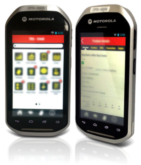
I was given the responsibility of designing the in-store mobile app for a very well known Australian retailer. This app would be deployed on 1200+ Motorola MC40 Mobile Computers, used by store staff in 325+ stores across Australia.
The MC40s would replace an older device that was very different (both in terms of hardware and software) and hence the transition had to be seamless with no disruption to stores.
The one line brief given to me was “Make this better and faster.”
State the Problem. Define Success
Early in my career, while working for an advertising agency, I learnt that “the ad is only as good as the brief“. This meant taking the one-line brief and doing a deep dive to understand business perception and identify the real problem that store staff faced.
To start of with, I conducted stakeholder interviews with top management and the different layers in store operations. This helped to understand what the business perceived as key issues.
At this early stage, it was critical to set expectations with the business and understand what success looked like and how it would be measured.
Note: These problem statement based on early assumptions may change based on user research and provide insights to either pursue further or pivot.
In the user’s shoes
The next step was to immerse myself in store-land and observe users . Initially the intent was to observe users going about their daily tasks. However, after a few days I requested management team to let me be more involved and perform some of the tasks myself.
While user observations provided some valuable insights, getting involved in performing tasks provided first hand experience of what users were doing in stores. The challenge here was to sift through the various issues encountered by store staff and identify the problem areas that were the main source of all these issues.
User Journeys and Task Flows
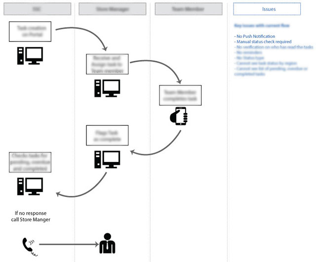
The User Journey map illustrated the multiple touch points and the series of interactions that users had to perform. This step helped to chart the different ways users achieved their goal as well as identify any gaps in the process.
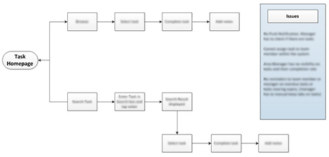
The Task Flow helped to understand the steps users had to perform for a specific activity within the app. It highlighted issues in the existing functionality and helped to prioritise functionality that was important and discard those that were redundant.
Wireframe. Test. Wireframe
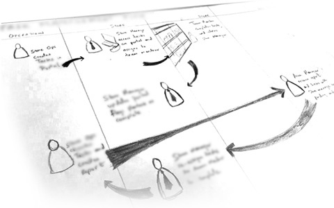
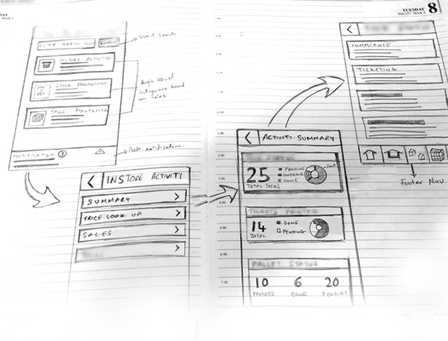
By this stage I had enough information to create wireframes for the new app. Initial wireframes were sketches in my diary. I frequently conducted quick tests with colleagues who were not directly involved in this project and updated the wireframes based on the feedback I received.
Wireframes are throw away. Designed and tested to find gaps in the flow. They are not meant to be pretty and wow audiences, but to get the functionality and information architecture as best as possible.
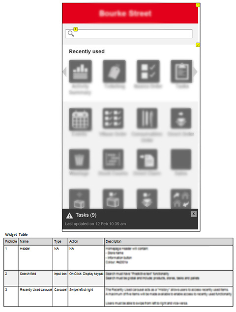
After a couple of iterations the rough wireframes started to get well formed. At this stage, I moved on to Axure and involved Store Operations and the Java developers at regular intervals for their feedback. Axure wireframes were annotated so that I could create a functional specification that the developers could use.
Note: I have used Axure in this project, however, I have also used Illustrator, Photoshop and PowerPoint to create wireframes. The tool should not matter as long as the design and purpose is well communicated.
Prototyping
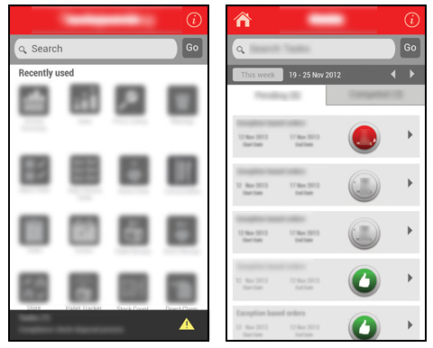
Additional time was spent on prototyping and testing with a couple of pilot stores. Prototypes were based on the Axure wireframes and utilised HTML, CSS and basic JavaScript to mimic actual functionality. These were not high fidelity mock-ups as they were meant to test functionality and task flows.
Prototypes were instrumented so that rather than asking users I could get real metrics on how the app was being used. (Thank you Google Analytics)
Similar to wireframes, prototypes were tested to get functionality right. They were used to identify issues and provide answers to how the app could be improved.
Final Implementation
Note: A new version is now being rolled out to stores using this process.
The first prototype was deployed to two stores. With each iteration, the prototype was refined and deployed to more number of stores. Prototypes went through a few iterative refinements before a suitable version was rolled out to all stores.
While this new app is faster and better in terms of UI design and functionality, A number of key issues faced by store staff were resolved including:
- Allowing users to be in control of daily tasks
- Reducing cognitive load while performing tasks
- Reducing manual/paper-work and time spent “walking the store”
- Changing behaviour to prevent loss of devices
- Reducing calls to Helpdesk by providing “just in time” training videos
- And importantly, consistent feedback provided to the users where relevant.
